Normally you would use a gallery plugin, however as some blogists don’t have access to install or update plugins they have to be create to get the look and feel they need. In this case I have used the oldest method out there to get a slightly funky look to images.
Step 1: First you will need to add your images to your media library, I will assume that you know how to do this already.
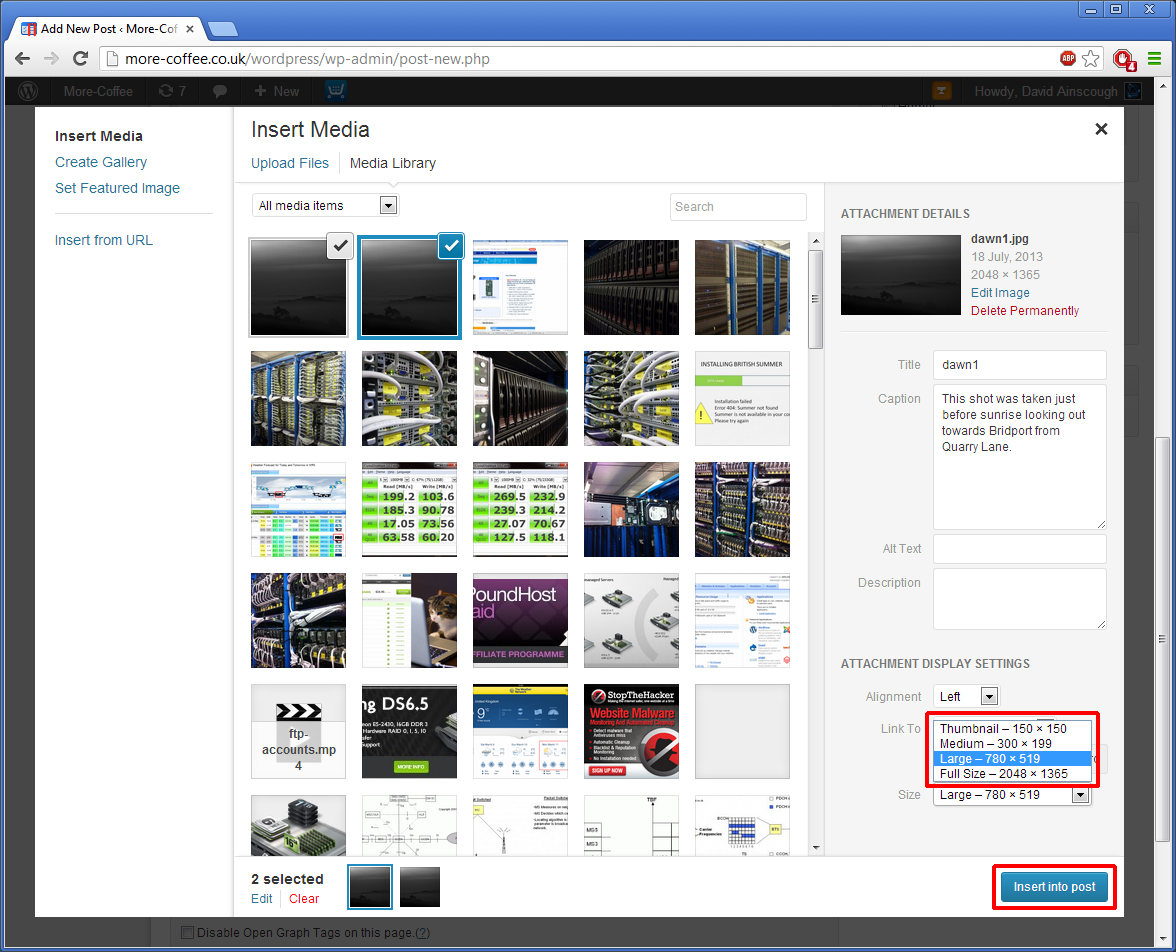
Step 2: Once you have added the images to your media library before you insert them you will need to edit the caption for the image, click on the “Caption” box and type in the content, You will need to do this for each image 1 at a time.
Step 3: Change the size of the image, if you are working with a blog that has a long thin content area then you should change the size to Medium, or it may over lap on menus and widgets.
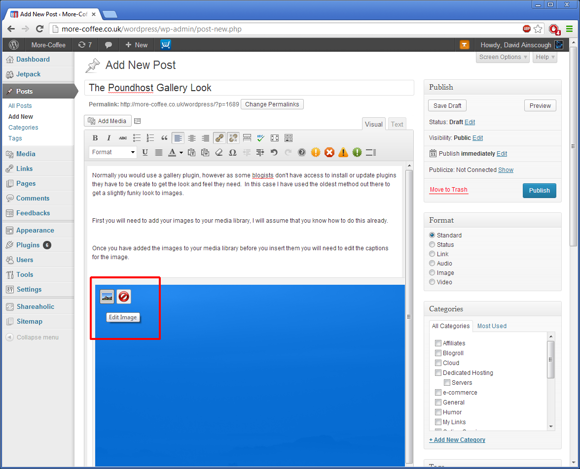
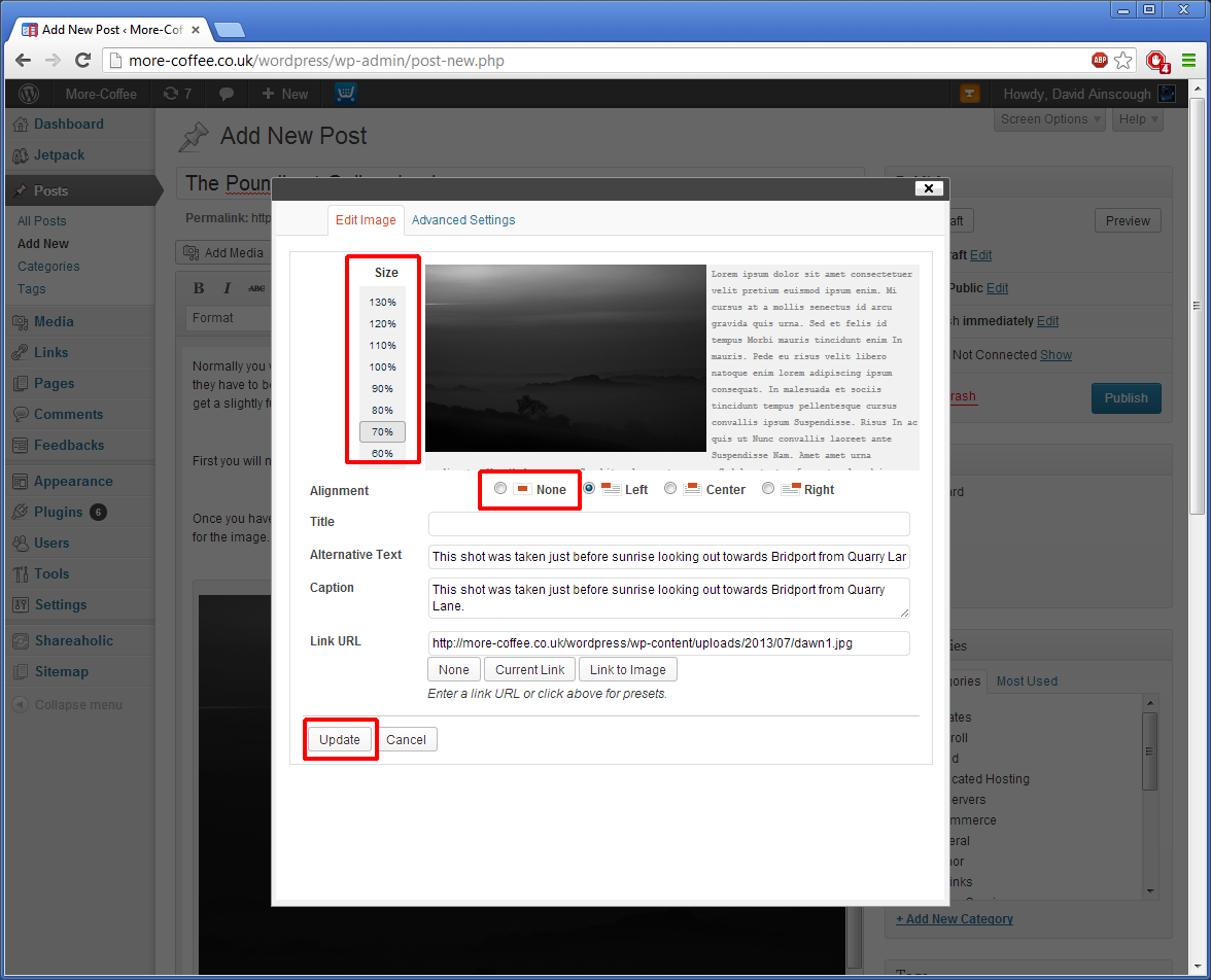
Step 4 : Use the Fine tuning in the edit image option once the image has been placed in the blog content area.
Step 5: Reduce the size so that it fits neatly into the content area, to avoid text wrapping around the sides, choose the “None” alignment option,
Step 6 : If you want to the image in the centre do this afterwards by highlighting the image and centre option from the normal text editing ribbon.


